Process- Digital Methodology
First Layer: Registration State TB Death Rates
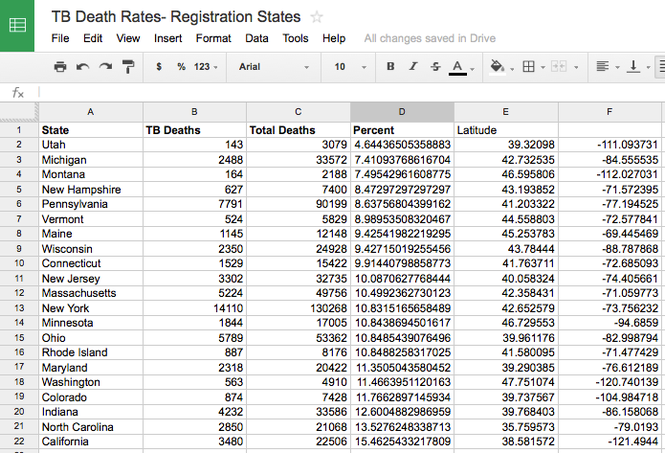
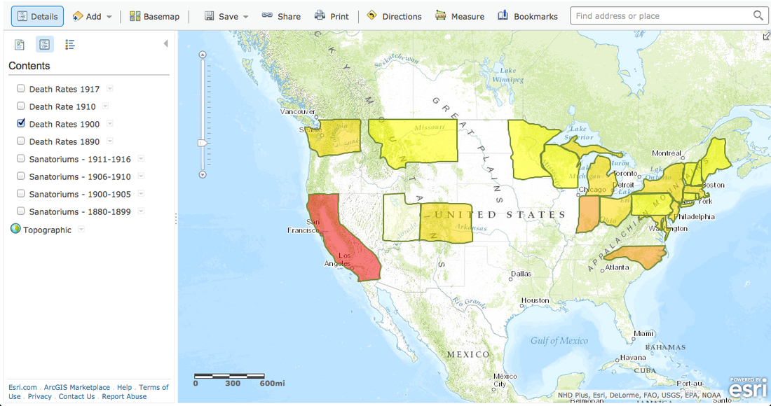
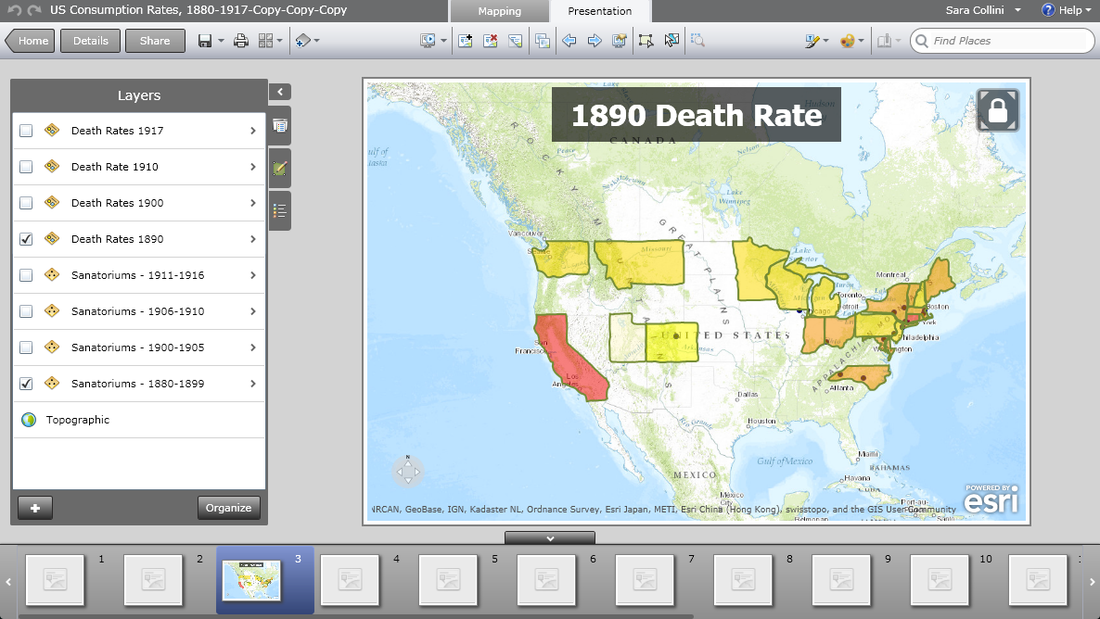
I found only the total deaths and total tuberculosis deaths listed in the US mortality statistics report by registration states. This limitation changed my project scope from the entire United States to only those listed registration states. So first, I entered the total deaths and tuberculosis deaths by 1890, 1900, 1910, and 1917 into a spread sheet. (The 1920 mortality statistics pdf would not open on my computer). I then created a simple percentage equation that calculated the percentage of tuberculosis deaths over total deaths for every state. In order to map the states, I manually drew their respective boundaries in the mapping program ArcGIS and created a standard death rate table for the color gradient:
0-7% Light yellow
7-10% Yellow
10-12% Gold
12-15% Orange
15-20% Red
Since I am new to digital tools, I created this "heat map" for each time period: 1890, 1900, 1910, and 1917. Each time frame exists as a stand alone layer in my edit mapping mode of ArcGIS.
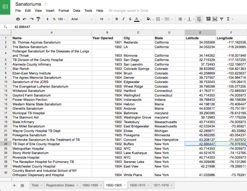
Second Layer: Public and Private Sanatoriums, Hospital Departments, and Pavilions (Isolated spaces)
For this layer, I created another set of spread sheets that listed the name, location, and construction year of these spaces from the 1916 Tuberculosis Directory. I configured their respective latitude and longitude coordinates and entered that information on the spread sheets, as well. I sorted the data by year opened, so I could layer the sanatoriums and death rate years concomitantly. ArcGIS allows for uploaded files from the user's computer, so I imported my spread sheet data as an csv (comma separated value) file into the mapping program. The different time frames- 1880-1899, 1900-1905, 1906-1910, 1911-1916- exist as separate layers.
For this layer, I created another set of spread sheets that listed the name, location, and construction year of these spaces from the 1916 Tuberculosis Directory. I configured their respective latitude and longitude coordinates and entered that information on the spread sheets, as well. I sorted the data by year opened, so I could layer the sanatoriums and death rate years concomitantly. ArcGIS allows for uploaded files from the user's computer, so I imported my spread sheet data as an csv (comma separated value) file into the mapping program. The different time frames- 1880-1899, 1900-1905, 1906-1910, 1911-1916- exist as separate layers.
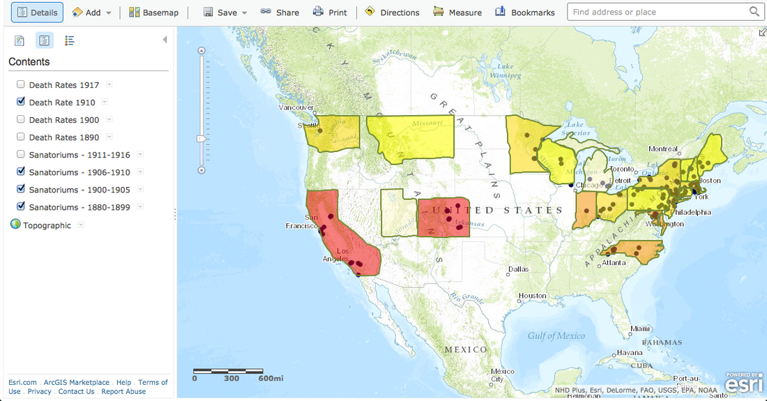
In order to create the temporal, layered heat map, one of my colleagues in the Center for History and New Media referred me to an online presentation of ArcGIS. I made a slide for each time period with death rates and sanatorium constructions for the whole United States. I then concentrated on California and Colorado in order to show an example of focusing in and out of the map. ArcGIS plays my slideshow/timeline, demonstrating change over time. However, I could not figure out how to make the temporal heat map interactive, allowing the reader to toggle years with sanatorium openings and zoom in and out of different areas. The ideal map would combine these features.
Digital Tools Used:
ArcGIS Map Viewer and Presentation Explorer
For more information on available digital tools for research, consult Bamboo DiRT
ArcGIS Map Viewer and Presentation Explorer
For more information on available digital tools for research, consult Bamboo DiRT
